SchoolMint SaaS EdTech
Brand Design, Creative & Video Editing:
Renzo Arecco
SchoolMint and its subsidiary Hero operate in the competitive EdTech space, but their brand presence told a different story than the one their products deserved. Both platforms, SchoolMint as a student enrollment solution and Hero as a student behavior, and attendance tool for K-12 schools, were functionally strong but emotionally flat. The existing branding lacked heart, failing to connect with the educators, administrators, and families who depend on these tools every day.
The challenge was clear: take an emotionless brand and transform it into something people could feel, believe in, and rally behind.
For SchoolMint, we built the identity around "Bright Years Ahead", an optimistic, purpose-driven narrative rooted in the belief that innovation and technology can create brighter, more sustainable futures for public school districts, charter schools, and the families they serve.
For Hero, a more playful "Be the Change" became a personal call to action, grounding the brand in the daily work of improving student behavior, boosting attendance, and reshaping school culture through positive reinforcement. What had been a cold, transactional brand experience became an emotional connection, a promise to educators and students alike.
The results speak for themselves: following the rebrand, SchoolMint and Hero's reach grew to over 12 million students and 17,000 schools across the United States, proving that when a brand finds its voice, people listen.
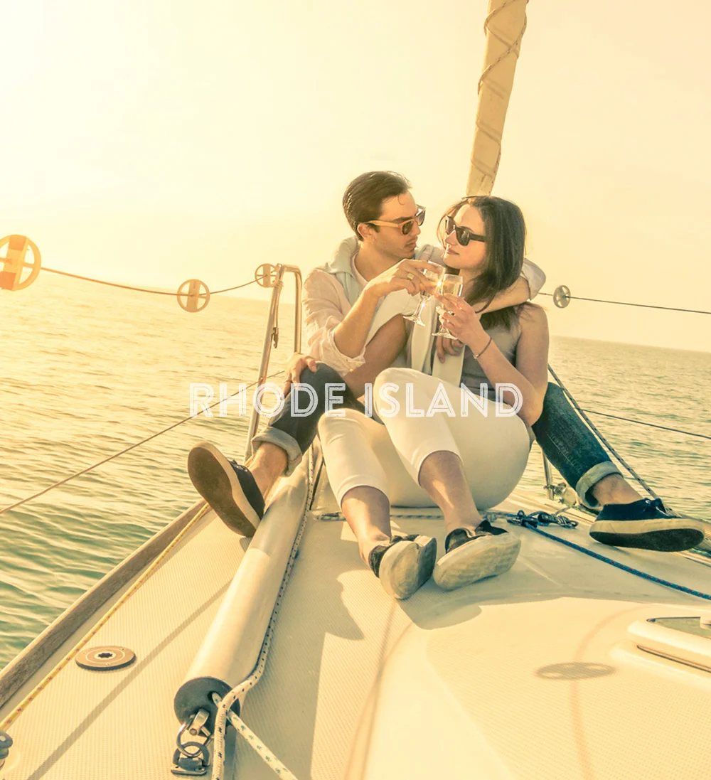
Web Design. Rhode Island Tourism Board.
Creative & Design: Renzo Arecco
Concept 1: The “Go Big” campaign was aimed to position Rhode Island as the state to go for big adventures, big memories, big personality and big business incentives that Rhode Island offers. The theme is playful in tone and directly addresses some of the misperceptions about Rhode Island being small, boring and culturally limited.
The imagery selected for this campaign is big, unexpected, bold and visually appealing. It also gives a great context to position as an ideal venue for meetings and for business relocation.
Concept 2: The Rhode Island “Fresh” campaign presents the state through a polished, modern lens, using the message “Get a New POV” to make Rhode Island feel renewed, stylish, and inviting. Its clean layout, dramatic hero imagery, and mobile-friendly design emphasize discovery, inspiration, and easy access to things to do, places to go, and trip planning, making it feel well suited for both leisure travel and broader destination marketing.
Digital Brochure Design. Universal Studios.
Creative & Design: Renzo Arecco
This Universal Studios digital brochure was created to advertise an exclusive partnership opportunity with Universal Studios Beijing, positioning the resort as a bold new launch for the brand and a one-of-a-kind chance for partner visibility (CityWalk Beijing).
Through cinematic imagery, polished layouts, and aspirational messaging, the piece presents Universal Beijing Resort as a fresh, year-round marketing platform where beloved characters, stories, and attractions come together to drive awareness, sales, and brand prestige.
Creative & Design: Renzo Arecco
This body of work reflects a clean, refined design approach with strong typography and clear visual hierarchy, allowing each brand's personality to come through while keeping the user experience elegant and intuitive. Across projects for The New York Palace, Eden Roc Miami Beach, Red South Beach Hotel, and Caldwell Advertising Agency, the layouts use balanced spacing, confident image selection, and purposeful type contrast to guide the eye and elevate the content.
The result is a collection of polished pieces that feel both sophisticated and versatile, moving comfortably between luxury hospitality, entertainment, agency branding, and medical technology. Each piece is designed with a modern editorial sensibility, balancing imagery and copy in a way that communicates credibility, clarity, and premium visual storytelling.
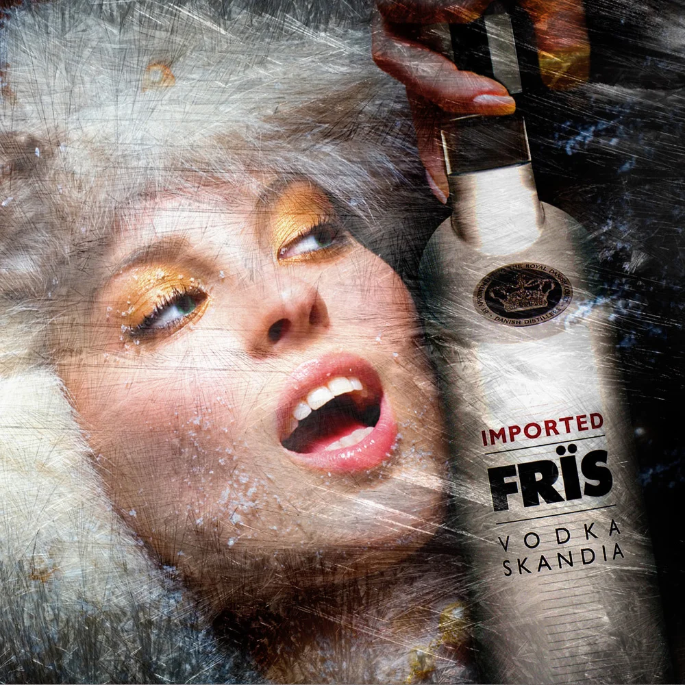
Advertising. Nissan, Fris Vodka, Miami Dolphins and Florida Panthers.
Art Direction: Renzo Arecco
This selection showcases a range of advertising work built on bold visual impact and striking imagery. Each piece crafted to stop the viewer and communicate a single, powerful idea. From the sleek, dynamic split-composition of the Nissan Quest campaign that contrasts engineering with refined interiors, to the icy, editorial-driven sensuality of the Fris Vodka print ad.
The sports pieces bring a different energy entirely: the Miami Dolphins "The Fans Are Here" ad channels raw fan passion through intense color, expression, and team identity, while the Florida Panthers poster leans into a gritty, textured, vintage-inspired aesthetic that feels tactile and alive.
Across automotive, spirits, and sports entertainment, the campaigns share a common thread—strong concepts, distinctive art direction, and a command of tone that adapts seamlessly to each brand's audience, whether selling luxury, lifestyle, or the adrenaline of game day.
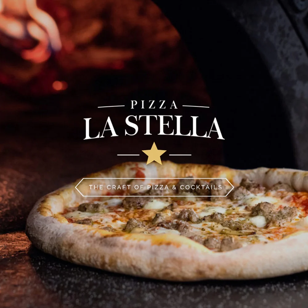
Branding. Pizza La Stella. Raleigh, NC.
Creative & Design: Renzo Arecco
Pizza La Stella opened in late 2016 as an authentic Neapolitan pizza concept, and I led the visual identity and creative direction for the restaurant from the ground up. I designed the end-to-end branding, partnering closely with stakeholders and a copywriter to shape every layer of the brand, from its mission and positioning to its tone of voice, narrative, and overall personality.
My role covered the complete visual system: logo design and exploration of multiple logo variations, typography, color palette, and a cohesive art direction that captured the craft and warmth of traditional Italian pizza-making. I extended the identity across the full customer experience, including the website design, photography direction and image curation, in-store signage, menus, storefront treatments, and a suite of print and digital campaigns.
The result is a refined, brand that balances rustic authenticity with modern sophistication, communicating quality, craftsmanship, and a genuine love for the craft of pizza and cocktails across every touchpoint.
Creative & Design: Renzo Arecco
This collection brings together logo and identity work spanning a wide range of industries, from advertising agencies, museums, and hospitality to healthcare, consulting and city governments. Each mark is developed from the ground up, starting with a deep understanding of the client's mission, audience, and competitive landscape, then translated into a visual language that feels authentic.
The work ranges from warm, hand-lettered scripts like Caldwell Group, to geometric, symbol-driven systems like the Art & History Museums Maitland, to bold, confident wordmarks like Quantum Agency, and refined, minimalist treatments like the BARH letterpress mark. Whether conveying aspiration, craft, heritage, or innovation, each logo is built on strong typographic choices, thoughtful color, and scalable construction, ensuring it performs across every application.
Advertising. Rhode Island Tourism Board.
Creative & Design: Renzo Arecco
The “Go Big” campaign was aimed to position Rhode Island as the state to go for big adventures, big memories, big personality and big business incentives that Rhode Island offers. The theme is playful in tone and directly addresses some of the misperceptions about Rhode Island being small, boring and culturally limited.
The imagery selected for this campaign is big, unexpected, bold and visually appealing. It also gives a great context to position as an ideal venue for meetings and for business relocation.
Digital Brochure Design. The London Eye
Creative & Design: Renzo Arecco
This digital brochure was designed to position The London Eye as a premium, world-class partnership opportunity for major global brands, following in the footsteps of previous sponsors Coca-Cola and British Airways.
The creative challenge was to communicate scale, prestige, and cultural relevance in a format sophisticated enough to appeal to C-suite decision-makers while still capturing the iconic energy of London itself. The design uses sweeping circular elements as a visual motif that tie every spread together, framing richly saturated cityscape photography of Big Ben, the Thames at dusk, and the illuminated wheel in moments of cinematic beauty.
Lifestyle imagery of tourists, couples, and families brings the human side of the experience forward, reinforcing the brand's emotional reach and mass-market appeal. Typography is clean, modern, and confident, balanced against a refined color palette of deep blues, magentas, and warm golden tones that evoke both the skyline and a sense of luxury.
Data points, rankings, and third-party validation (TripAdvisor, PwC) are layered into the narrative to make the business case, while the overall pacing builds toward a clear value proposition: aligning a brand with one of the most recognizable and celebrated attractions in the world. The result is a brochure that feels less like a sales pitch and more like an invitation to join an iconic legacy.
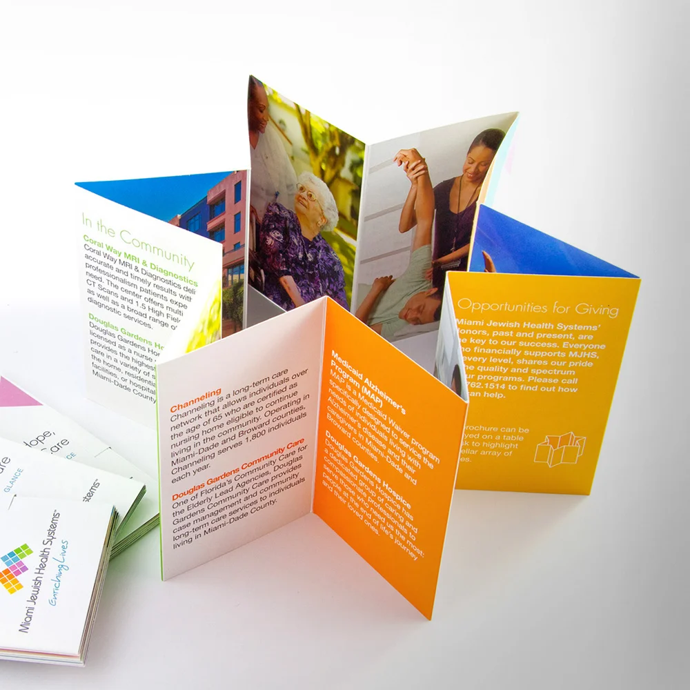
Branding. Miami Jewish Health Systems.
Creative & Design: Renzo Arecco
Award-winning rebrand of Miami Jewish Health Systems (MJHS), formerly Miami Jewish Home for the Aged.
From website design to collateral, we’ve created it all for Miami Jewish Health Systems. By thoroughly researching market trends, creating an overall strategy for success, and implementing our big ideas, we were able to bring maximum exposure to the Miami Jewish Health Systems brand. In turn, the company is able to live out its mission – to help people of all ages enjoy longer, healthier and more enriched lives.
- Gold Addy Award 2010.
- Best Non-Profit Brand Award by TopNonProfits.com
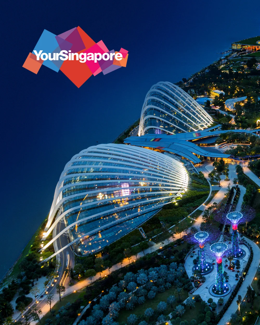
Creative & Design: Renzo Arecco
Print and Digital campaign for Travel Weekly and AirBnB magazine. Singapore Tourism Board.
I designed a print and digital campaign centered around three different themes that positioned Singapore as the ideal destination for the American traveler.
The theme “City of the Future” highlights Singapore’s innovations in sustainability, architecture and more.
“Gateway to Asia” positions Singapore as the perfect first-stop on a multi-destination vacation in southeast Asia, whether by land, air or sea.
Finally, the “Active Silvers” theme focuses on the fact that Singapore is safe, accessible and easy to navigate, making it the perfect vacation for active adults ages 60 and up.
Creative & Design: Renzo Arecco
This collection showcases unified identity work where the brand lives far beyond the logo, extending into every touchpoint to create a cohesive, immersive experience that builds real brand affinity.
For each client, the identity system is developed as a complete language: color, typography, photographic style, graphic elements, and tone of voice all work together to ensure that whether someone is picking up a business card, visiting the website, walking through the office space, opening a brochure, or reading an annual report, they feel the same brand personality.
Caldwell Group brings warmth and approachability through its coral palette, hand-scripted wordmark, and conversational "Hello! Nice to meet you" touches carried into business cards, digital portfolio, and even the physical office environment.
Blackmaple Group projects authority and transformation through bold red-and-charcoal geometry, refined typography, and striking black-and-white imagery that extends seamlessly across logo, website, and executive collateral.
SixthSense translates the complexity of medical technology into an approachable, modular system of colorful tiles—mirroring the product's integrated-modalities concept across web, mobile, print, and trade-show materials.
Miami Jewish Health Systems uses its mosaic-inspired identity to communicate community, care, and diversity across annual reports, event invitations, residence brochures, digital platforms, and campaign collateral.
Ascend unifies a family of healthcare services under a single uplifting arrow mark, using a color-coded sub-brand system and a warm, people-centered photographic style that carries the parent identity consistently across all touch points.
Together, these systems demonstrate that strong branding isn't a single asset—it's an ecosystem, where every piece reinforces the others and elevates how the brand is felt, remembered, and trusted.
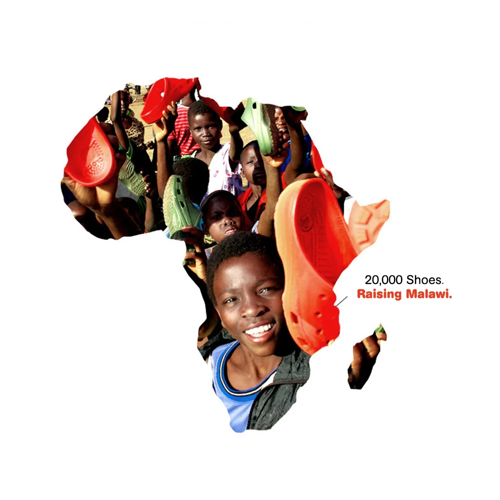
Advertising. Crocs Shoes, Soles United.
Art Direction: Renzo Arecco
This body of work for Crocs spans two distinct but complementary creative territories. The humanitarian storytelling of the Soles United initiative and the lifestyle-driven branding of the core Crocs product line. The Soles United campaign, which supported the donation of thousands of shoes to children in Malawi, uses a powerful, restrained visual language: stark black-and-white photography punctuated by a single vibrant red, letting the color of the shoe become a symbol of hope, dignity, and human connection. "There's hope in every sole."
In contrast, the consumer-facing Crocs ads embrace a lighter, more playful tone, using clean white space, bold product photography, and clever visual metaphors. The legs dancing on a flower stem and a red Croc nestled inside a rose, celebrate comfort, personality, and joy. Together, the pieces demonstrate how a single brand can move fluidly between purpose-driven storytelling and accessible lifestyle marketing, each campaign sharing the same core DNA: simplicity, strong color, and a singular visual idea that speaks louder than words.